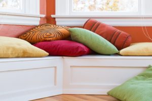
If you follow design trends, chances are you know all about the Pantone Colors of the Year and the impact they can have on interior choices. For 2017, the color of choice goes against some of the more recent shades, and can be a big wake-up call that has you seeing green. Literally!
That's because Pantone has chosen "Greenery," also known as PANTONE 15-0343, as this year's color of choice. It's an interesting pick for a few different reasons, and can be a great jumping-off point if you're ready to try something different.
Breaking with tradition
First of all, greenery makes a nice change of pace from the last few Colors of the Year. While 2013 did have the Emerald shade, other recent selections used elements of red and purple, from Marsala in 2015 to Tangerine Tango in 2012. Even Emerald was closer to blue-green in hue, while Greenery is a lighter, brighter color that stands out from the pack. It's a good bet that if you try to switch things up, this could be the color for you.
Lightening up the mood
Part of the reason Pantone chose this color is for the emotional connection that comes with it. In a statement announcing the new choice, Pantone Color Institute Executive Director Leatrice Eiseman explained the symbolic reasons behind putting greenery into design.
"While Serenity and Rose Quartz, the PANTONE Color of the Year 2016, expressed the need for harmony in a chaotic world," Eiseman said. "Greenery bursts forth in 2017 to provide us with the hope we collectively yearn for amid a complex social and political landscape."
This also goes along with the general idea of putting plants and other green images in the office for a soothing atmosphere. Taking that into the home can also involve adding other soothing elements, such as more sunlight, to leave the room feeling natural and open.
A little touch here and there
You don't have to go overboard with this color or similar shades either to get the most out of them. A piece in Vogue about the latest interior trends suggested that green could be a great addition to other surfaces, breaking up the monotony of a white background.
Consider, for example, a room with white walls but several matching bright green pieces within it: it's enough to get the point across and create a distinctive mood in the area.
For Missouri furniture and interior pieces, contact Arwood's Furniture & Mattress today!


